
This guide establishes the foundation of the Whop brand identity. These standards exist to keep the brand cohesive across all surfaces, defining a solid base from which it can grow and evolve.
This guide doesn’t cover every possible scenario or answer every question. Treat this document as a source of truth, and refer to it any time you’re producing an artifact that represents Whop.
Strategy
Mission
Our mission is to deliver everyone a sustainable income.
What is Whop?
Whop is building the first end-to-end API for running a business, enabling money movement, customer acquisition, and mobilization of an on-demand workforce.
Who are we building for?
We are building for the Global Fortune 5,000,000 — small to medium sized businesses run by people just like us.
These businesses are underserved, and are the backbone of so many local economies across the world.

Culture
Origin story
Steven and Cameron met at 13 in a Facebook group. Together they went business to business building sneaker bots, crypto arbitrage bots, drop shipping SaaS, and app development agencies.
Each business required multiple platforms to talk to customers, build websites, fulfill products, and accept payments. There wasn’t a centralized hub on the internet to do business, so in 2021 they started building Whop.
Team
We’re always looking for talented individuals from unique backgrounds to join our team. Find out more here.
Our team is made up of a bunch of internet entrepreneurs and ex-founders who have come together to build the infrastructure for the next generation of internet entrepreneurs.

Principles
Our principles are the standards that we hold each other to on a daily basis.
-
Be technical
What you’re writing, building, and doing should be technically correct — true or based in fact — even if it contradicts common sense or knowledge.
-
Force function
Every surface that you touch should improve by an order of magnitude. Approach problems as a forcing function for deep solve. Do not address the symptom, address the root.
-
Disagree; then commit
Fight tooth and nail when decisions are being made, but commit hard to the objective once a consensus is reached.
Philosophy
Our philosophy directs how we think about and build product.
-
Global
We believe in frictionless, global open finance. This is why we’ve implemented crypto rails as a scalable solution for money movement. We build for the future where stablecoins are ubiquitous.
-
Multiplayer
While we believe in lean businesses and an individual’s ability to run an effective enterprise, we also believe that the most important element of the social-commerce layer of the internet is still network effect — coordination between both humans and agents alike.
-
Hypermodern
We do not build the past, we build a new layer on top of it. Our work should compound and consolidate. Good artists copy, but great artists steal. Utilize the past; build the future.
Voice & Tone
Our voice & tone in writing and presentation across all surfaces, both internally and externally.
Our voice is immediate & intentional. Our tone is provocative & unapologetic. We balance a sense of urgency with an air of effortless grace.
Language
Here are some general guidelines to follow when writing or speaking on Whop’s behalf
- Speak clearly and simply using active verbs when possible
- Don’t say “digital,” “digital creator,” “creator economy”, or “payment processor”
- Opt for “internet entrepreneur”, “internet economy”, and “powering X, Y, or Z” instead.
- Don’t commit aura-loss
- Frame things in an optimistic, future-forward manner

Logo
Brandmark
Our brandmark is the simplest element of our brand. It works as a standalone symbol that represents Whop.
Lockup
The lockup is a structured pairing of our brandmark and our wordmark that should not be altered. It’s the primary choice for brand representation in external facing contexts.
The duotone lockup is suitable for dark mode or light mode styled backgrounds. Never place the duotone lockup on colorful backgrounds.
Color
When combining the lockup with an approved color background, make sure that the logo is clear and legible in either white or black.
Avatars
Here are some pre-approved avatars for social accounts of team members. These also work as icons for the website, the mobile app, shortcuts, etc.
Logo Clearance
To protect the logo from other visual elements, make sure there’s adequate clear space surrounding it.

Logo Misuse
What to avoid when using the logo.


Color
Primary Palette
Whop’s primary brand color is our signature Vermilion, also known as “Whop Orange”. Vermillion evokes energy and positivity, amplifying our core brand values. It is complemented by the monochrome shades Off-White and Charcoal.
- Name:
- RGB:
- HEX:
- Name:
- RGB:
- HEX:
- Name:
- RGB:
- HEX:
Secondary Palette
Our secondary color palette consists of Indigo, Cerulean, and Chartreuse. The cooler tones in this palette complement Vermillion nicely. This palette is used more sparingly.
- Name:
- RGB:
- HEX:
- Name:
- RGB:
- HEX:
- Name:
- RGB:
- HEX:
Grayscale Palette
Our grayscale palette is useful for graphic elements like text, grids, borders, and lines.
- Name:
- RGB:
- HEX:
- Name:
- RGB:
- HEX:
- Name:
- RGB:
- HEX:
Typography
Primary Typeface
Acid Grotesk is our primary typeface. Its balance of modern simplicity and bespoke character amplifies our brand voice.
We utilize the double story “a” and “g” highlighted below. We opt for “high ascenders” for lowercase characters that extend past the mean line.
Acid Grotesk
ABCDEFGHIJKLMNOPQRSTUVWXYZ
abcdefghijklmnopqrstuvwxyz
1234567890!@#$%^&*(){}[]?!
Acid Grotesk Medium and Regular are the primary weights for hero brand assets across physical and digital media while Acid Grotesk Book and Light work nicely for body text, pitch decks, and memos.
- Acid Grotesk Light
- Acid Grotesk Book
- Acid Grotesk Regular
- Acid Grotesk Medium
Secondary Typeface
Inter is our secondary typeface. We utilize it for small captions, data visualization labeling, and various product UI elements.
Inter
ABCDEFGHIJKLMNOPQRSTUVWXYZ
abcdefghijklmnopqrstuvwxyz
1234567890!@#$%^&*(){}[]?!
Inter Regular is the first choice for captions, data-labeling, and body text in the product. Inter Medium and Semi Bold can be used to emphasize a specific element. Inter Light is used sparingly if at all.
- Inter Light
- Inter Regular
- Inter Medium
- Inter Semi Bold
What to Avoid
When creating an asset with text on Whop’s behalf, please add our brand library, accessible here with pre-determined text styles that you can add to any Figma design file.


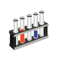
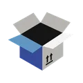
Imagery
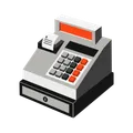
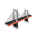
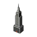
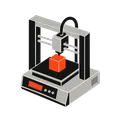
Pictograms
We utilize an updated suite of three-quarter perspective pictograms across product surfaces. The pictograms convey the playful and gamified nature of making money on the internet.


Data Visualization
We utilize an extended version of our color palette for data visualizations. The extended palette consists of 18 colors and is designed to make data both legible and engaging.

